PROCESS
I led this strictly 90-hour solo project, spread across 7 weeks, from research to high-fidelity mockups.
CONTEXT + TASK AT HAND
Submerge is a fictional company with a desktop website that monitors subscriptions over multiple years. Their desktop-only website needs mobile-friendliness to expand their market scope and attract a more extensive user base :
I was assigned to develop a mobile-friendly counterpart of the company's desktop offering.
FINAL DELIVERABLES
Manage your account
Comprehensive dashboard providing seamless access to all other screens within the application.
Easy setup for subscription alerts to prevent missed payments.
COMPETITIVE RESEARCH
I LEARNED THAT
Seamless Onboarding
A concise overview of app features and benefits for users to showcase its value.
Automated subscription transfer after account linkage; no manual entry needed.
Clear and concise instructions at each stage of the onboarding.
The comparison screen displays plan options alongside the existing plan and recommends similar services, aiding economic subscription decisions.
User engagement and experience
Centralized subscription directory providing easy access to discover new subscriptions.
Subscription customization options are available.
The comparison screen displays plan options alongside the existing plan and recommends similar services, aiding economic subscription decisions.
I started the research process by reviewing app store ratings and watched YouTube videos to gather user experiences from popular applications as below:
RocketMoney
Bobby
Mint
I assessed their usability, usefulness, and user experience based on three heuristic principles to understand how to implement a solution that enables users to accomplish tasks quickly and efficiently while maintaining control over their interactions. Furthermore, I aimed to provide access to dependable support resources whenever needed.
Help and documentation
User control and freedom
Flexibility and efficiency of use
The table below provides a detailed overview of the findings.
KEY INSIGHTS FROM COMPETITIVE ANALYSIS THAT I WILL FOCUS ON AS I PROGRESS FURTHER DOWN THE DESIGN PROCESS
Sharing relevant details about the company on the application's front end gives users a sense of ease when handling their personal financial information.
Clear and consistent calls-to-action (CTAs) to improve user experience.
Customization options to tailor the app to their specific needs and preferences.
RESEARCH QUESTIONS:
Which services are you currently subscribed with?
How do you track information of your subscriptions?
What specific information do you track for your subscriptions? ( check on subscription expenses and renewal dates if not included in the answers)
How do you receive notifications and reminders for upcoming subscription renewals or payment due dates?
How do you mostly cancel a subscription?
Have you ever accidentally paid for a subscription that you meant to cancel?
5/5 participants expressed concerns about scattered subscriptions and deprivation of management.
After
PERSONA + USER FLOWS
Provided the opportunity to nix unneeded functionality and focus more on a user-centric approach that aligns with business goals effectively.
4/5 participants struggled with forgetting to cancel subscriptions on time.
After
4/5 participants expressed difficulty with the cancellation process.
User flow for goal #1 - Streamlined onboarding screens automatically transfers existing subscriptions for new users and any new subscriptions for existing users, eliminating the need for manual inputs.
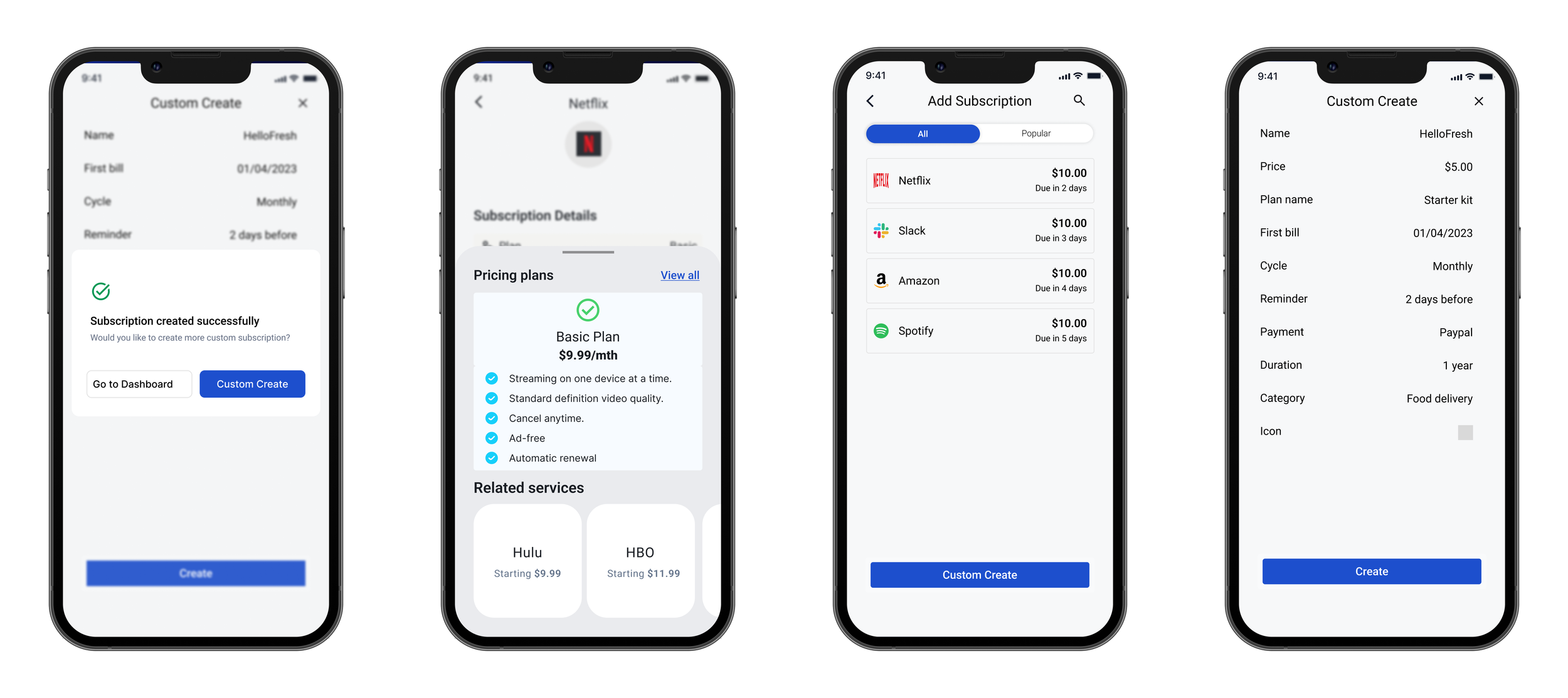
User flow for goal #2 - This flow enabled a unified understanding of the user journey to successfully search for or customize subscriptions and add them..
User flow for goal #3 - Addressing a common user concern - the ability to set up alerts for timely reminders before money deduction.
DESIGN ITERATIONS BASED ON USABILITY TESTING
Before
Before
Before
THE FINAL SCREENS
NEXT STEPS AND LESSONS LEARNED
During this project, I learned that when designing digital products involving users' financial data, it is crucial to include the company's details on the application's front end and provide a small demo video or screens illustrating how the application works and its benefits. This way, users can familiarize themselves with the app's functionalities and understand how to perform different actions.
Usability testing confirmed that straightforward navigation fosters trust and confidence among users, significantly boosting their chances of signing up for the application.
Overall, this project was instrumental in helping me identify and achieve the alignment between user needs and business objectives. By leveraging this understanding, I successfully created an experience that benefits the users and meets the stakeholders' goals.
If I had more time,
I would have further conducted the usability testing with a set of users and iterated designs based on their feedback.
I would have conducted A/B testing with analytical screens because numerous options were available for showcasing the financial details.
WHAT WOULD I DO DIFFERENTLY
After
would implement a feature that offers personalized cost-saving recommendations for users' existing subscriptions. This feature would analyze the users' subscription usage and spending patterns, identifying potential areas where they could save money or optimize their subscriptions. This enhancement would add significant value to the app, empowering users to make financially sound choices and enhancing their overall experience.


