

PROJECT TIMELINE
April (4 weeks)
MY ROLE
Design lead for a team of 3 designers on the client project
CLIENT’S BRIEF
Elevate Resiliency is a Toronto-based non-profit organization dedicated to fostering a safe and inclusive community for Black and minority women who have faced gender-based violence or sexual trauma. The organization aims to create an environment where affected individuals feel safe, supported, and empowered to make mindful choices in their lives.
CHALLENGE
Elevate Resiliency currently faces a challenge regarding the insufficient conversion of prospects into actively engaged customers.
Elevate Resiliency heavily relies on word-of-mouth for attracting new members to their services and programs. To broaden their reach, they implemented a new website and social media platforms. However, the website did not achieve the anticipated level of interest and engagement.
SOLUTION
My team and I, decided to redesign the home page with major focus on
Hierarchy
Navigation
Use of Colors
The goal is to effectively communicate the value proposition and prioritize the "Contact Us" feature on the website. Customers should easily understand the services and benefits of joining the programs. With our redesigned version that is easily digestible, customers will be more convinced to explore Elevate Resilience programs and contact their team for inquiries or enrollment.
OUR APPROACH

PRE-CLIENT TEAM MEETING
My team and I discussed the client's project brief and objectives, which were emailed to us, and decided to take the following actions in preparation for the strategy session with the client.
Key findings from the UX audit that were discussed with the client during the first meeting were:

01
02


03

04
Next, we analyzed three similar websites to identify their strengths and determine the necessary updates for the Elevate Resiliency design.
The common features we found were:
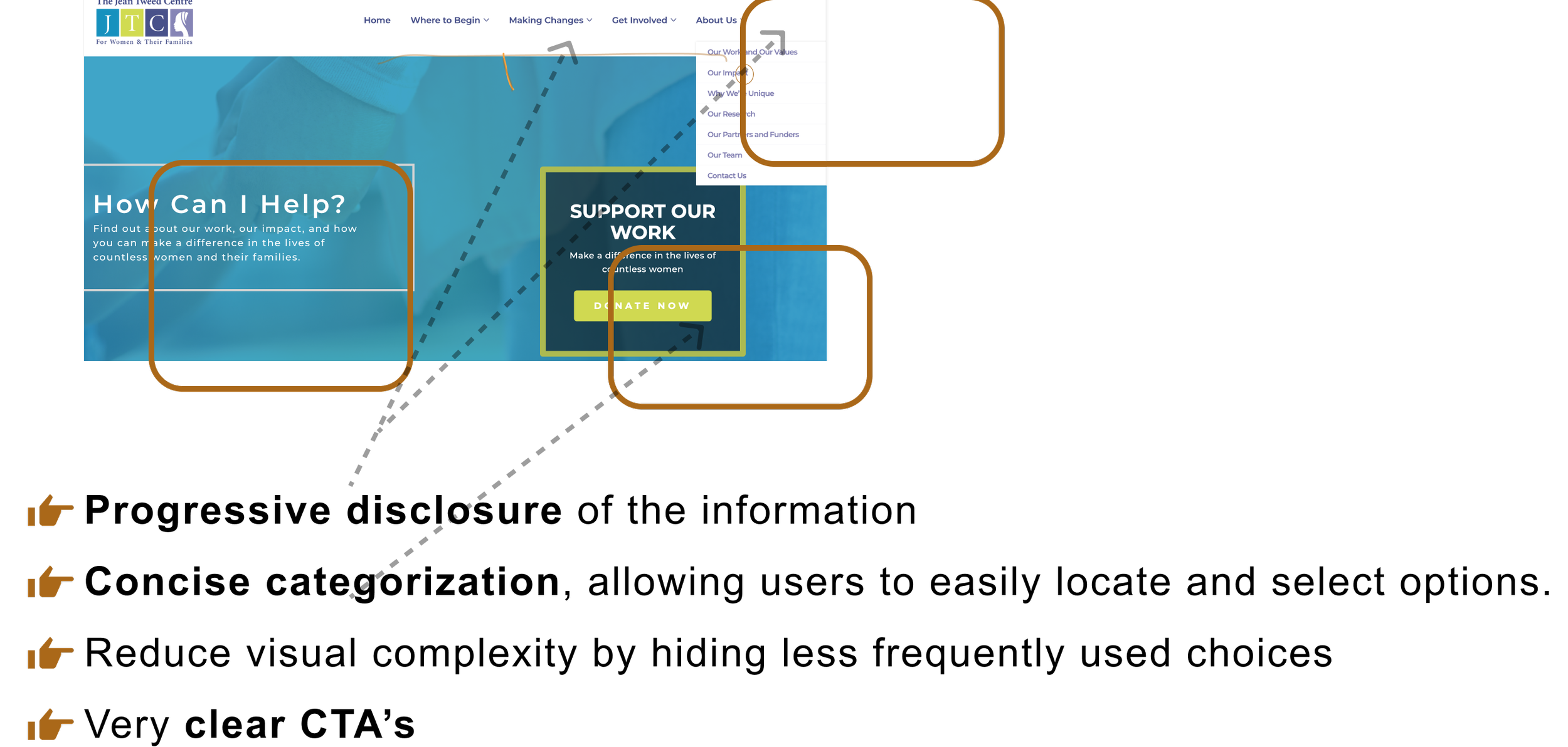
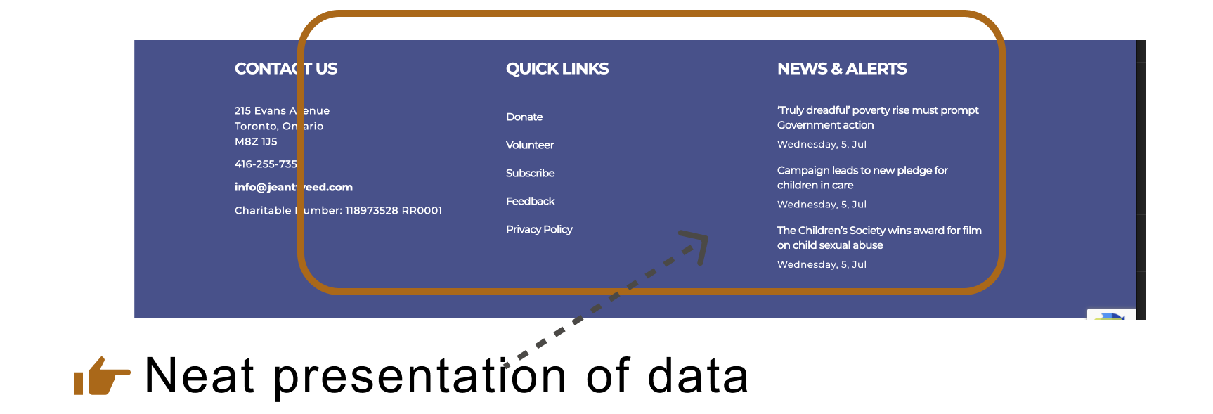
Progressive information disclosure: These websites presented a high-level overview of their organization's activities on the Home page and provided more detailed information on dedicated pages.
Clear calls to action (CTAs): The websites used prominent and easily understandable CTAs to guide visitors towards desired actions.
Distinct sections for services: Each organization had separate sections dedicated to showcasing their various services, making it easy for visitors to navigate and find the services they were interested in.
By studying these successful elements, we gained valuable insights to enhance the design of Elevate Resiliency.
01 https://jeantweed.com/
02 https://sheenasplace.org/

03 https://jeantweed.com/


DEFINING THE MENTAL MODEL TO ENABLE US THINK FROM USER’S PERSPECTIVE AND DEFINING THE TASK MORE CLEARLY
Furthermore, at this stage, our team recognized the importance of discussing the mental model of users.
The user doesn't engage in this frequently and is currently vulnerable, requiring additional guidance and a sense of security.
The user is likely aiming to seek help, which may involve disclosing personal information. Therefore, they will exercise caution and be extra careful with their decisions.
FIRST CLIENT MEETING / STRATEGY SESSION
During our initial meeting, the client provided additional details regarding the issues they wanted our assistance with, specifically concerning their homepage. We took the opportunity to present our findings from the competitive analysis and UX audit, and it was a reassuring moment as everyone involved agreed on the identified concerns and areas for improvements. This alignment allowed us to move forward with a shared understanding, setting a solid foundation for the collaborative efforts ahead.
The specific tasks that my team and the client have agreed upon to achieve the client's goal are as follows:

USABILITY TEST OF THE CURRENT HOMEPAGE AND KEY INSIGHTS
To identify pain points and assess areas for improvement, we carried out usability tests with five users, using the current design as a basis.
A major concern that arose was that none of the users could understand the current offerings of Elevate Resiliency easily. The content on the Home page was deemed confusing and overwhelming by all users.
We identified the following key theme based on the notes that we made during the usability test

PERSONA
We then proceeded to map the insights into personas that encapsulated the traits of the target users.

HOW MIGHT WE STATEMENT DEFINED THAT ENCAPSULATES ALL THE FINDINGS
Now it's time to synthesize everything we've learned during the research process and define it as a "How Might We" (HMW) statement. We'll use this statement as an anchor for building design concepts and ideas.
“How might we achieve an optimal arrangement of the home page to enable easy user orientation, smooth navigation, and ultimately boost the conversion rate of users?”
USER FLOWS TO ADDRESS SPECIFIC RED ROUTES
My team and I defined two red routes we want to explore for this project.
User's path to explore and discover relevant content.
User path to click "Contact Us" to contact client for assistance.

01 Sketch for home page

STYLE GUIDE
We adhered to the style guide used by the client.
FINAL SCREENS


Elevate Resiliency current “Contact us” form

NEXT STEPS AND LESSONS LEARNT
For next steps,
02 Sketch for ‘contact us’ form


Elevate Resiliency redesigned “Contact us” form

This project provided me with exposure to working in a team environment and with a real client. Here are a few key learnings from this experience:
At the project's beginning, dealing with designers in different time zones and lacking access to actual users for usability testing posed challenges. However, we successfully found workarounds and are proud of our collaborative achievements.
We learned the importance of using straightforward language that is easily understandable to people.
Another valuable learning experience was understanding how diverse ideas within a team can converge to achieve excellent results.
SKETCHES